A Tale Of Two Brothers - Portraits
Moderator: Forum Moderators
-
West
- Retired Lord of Music
- Posts: 1173
- Joined: October 30th, 2006, 7:24 am
- Location: In the philotic connections between ansibles.
- Contact:
A Tale Of Two Brothers - Portraits
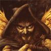
No, it has not taken me this long to do this. I've been trying to write some music but as I'm not really getting anywhere with that ATM I sat down to make some artwork instead. This is a quick initial sketch of Arne's portrait.

Not much to comment on right now, I know, I just wanted to be clear on a few things:
1. Should he look more comic book-like?
2. Does he need to have his helm on like in the current portrait? I think he looks a bit more heroic with it off.
3. Should I add more of his torso and maybe his hands holding a sword (i.e. with just the pommel showing)?
It all depends on the coloring I think, the outlook is great.
The actual portrait is all up to you, play with it.
I haven't played tale of two brothers so long, I can't even tell you if it fits the unit.
Your try looks realy good so far, if you are a little lost on how to color and other things there are great lesson to be learned on the art forums.
Good luck, I atleast appreciate your art, continue you are much more prommissing than me

Re: A Tale Of Two Brothers - Portraits
So far, it's looking great!West wrote:Not much to comment on right now, I know, I just wanted to be clear on a few things:
No. He (stylistically) looks perfect the way he is, don't change that.West wrote:1. Should he look more comic book-like?
It's your call; for what it's worth, I like him without it, and the armor is a sufficient cue to indicate that he is a knight.West wrote:2. Does he need to have his helm on like in the current portrait? I think he looks a bit more heroic with it off.
It could have a bit more of his torso showing. If you want to go as far as you described, that's fine, too.West wrote:3. Should I add more of his torso and maybe his hands holding a sword (i.e. with just the pommel showing)?
-
West
- Retired Lord of Music
- Posts: 1173
- Joined: October 30th, 2006, 7:24 am
- Location: In the philotic connections between ansibles.
- Contact:
Thanks, but I think I'll managetraverser wrote:if you are a little lost on how to color and other things there are great lesson to be learned on the art forums.
Thank you so much.traverser wrote:Good luck, I atleast appreciate your art, continue you are much more prommissing than me
Hehe... thanks. I just hope I won't disappoint you.Jetryl wrote: So far, it's looking great!I'm glad I gave this job to you, it looks like the finished version will be perfect.
One thing though, about the coloring: is the cel-shaded style of the other portraits what I should be aiming for? Or should I make it more... uh... painting-like? Personally I prefer the latter but it's your call.
If the final project looks as good as this one I would download 1.2 even only to see the portrait. But the art of Neo, Jetryl, fmunoz and others is too good to bypass. Continue and you will soon make my list of awesome artists.
All artwork greatly appreciated Your portraits are definitelly as good and comic-like as Wesnoth portraits should be.
I will draw myself extra thumbs to give you four thumbs up
All artwork greatly appreciated
I will draw myself extra thumbs to give you four thumbs up
Painting-like. I prefer it, and most importantly, you prefer it and you do very well in it.West wrote:One thing though, about the coloring: is the cel-shaded style of the other portraits what I should be aiming for? Or should I make it more... uh... painting-like? Personally I prefer the latter but it's your call.

-
West
- Retired Lord of Music
- Posts: 1173
- Joined: October 30th, 2006, 7:24 am
- Location: In the philotic connections between ansibles.
- Contact:
Yes, you're probably right. Maybe that's what's bothering me. I'll try fixing that. Plus, I'll make the upper arm slightly thicker as Zhukov suggested; it does look a bit skinny right now, considering there's a piece of steel plate strapped to it...
I will of course have to clean up some stuff aside from the above, but I think this guy might be ready for some color after that.
I will of course have to clean up some stuff aside from the above, but I think this guy might be ready for some color after that.
-
West
- Retired Lord of Music
- Posts: 1173
- Joined: October 30th, 2006, 7:24 am
- Location: In the philotic connections between ansibles.
- Contact:
Awright, I've touched up Arne's arm a bit. If no one sees anything terribly wrong with it, I could begin colorizing the image.

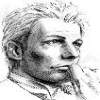
Also, here's a first five-minute sketch of Bjarn.

OK, I know, some might object against the silly hairdo and that maybe he doesn't look very mage-like. But I'm sick of mages with robes and hoods and staffs so I went for a more scholarly (and slightly dorky) look.
On a side note... and this is no big deal but... being a Swede I find the names of those characters a bit odd. Arne is not an uncommon name in Sweden. Bjarn sounds more Norwegian, but Björn is on the other hand a very common Swedish name also. It just doesn't sound very fantasy-like. To put it in perspective for English-speaking people, it's as if the two main characters would be called Bill and Steve. A silly remark, I know, I just wanted to mention it
Also, here's a first five-minute sketch of Bjarn.
OK, I know, some might object against the silly hairdo and that maybe he doesn't look very mage-like. But I'm sick of mages with robes and hoods and staffs so I went for a more scholarly (and slightly dorky
On a side note... and this is no big deal but... being a Swede I find the names of those characters a bit odd. Arne is not an uncommon name in Sweden. Bjarn sounds more Norwegian, but Björn is on the other hand a very common Swedish name also. It just doesn't sound very fantasy-like. To put it in perspective for English-speaking people, it's as if the two main characters would be called Bill and Steve. A silly remark, I know, I just wanted to mention it
-
West
- Retired Lord of Music
- Posts: 1173
- Joined: October 30th, 2006, 7:24 am
- Location: In the philotic connections between ansibles.
- Contact:
If you mean Circon is from Scandinavia, it makes even less sense. I assumed the names were picked by someone who thought they just sounded "exotic" and had no idea that they were common names in this part of the world.wayfarer wrote:About the names as I recall the original author Circon came from this area.
Don't worry. If Ivanovic gave them a user_description tag. The swedish translation team may rename them if they want.
WesCamp-i18n - Translations for User Campaigns:
http://www.wesnoth.org/wiki/WesCamp
Translators for all languages required: contact me. No geek skills required!
http://www.wesnoth.org/wiki/WesCamp
Translators for all languages required: contact me. No geek skills required!
-
West
- Retired Lord of Music
- Posts: 1173
- Joined: October 30th, 2006, 7:24 am
- Location: In the philotic connections between ansibles.
- Contact:
I wonder how many Swedes will use the Swedish translation though. We're quite used to games not being localized 
Anyway, back on topic...
I've spent a few hours trying to colorize Arne. I'm afraid it's not turning out anything like I had hoped though.

Obviously this is far from finished and the armor is quite sloppy. I think I'm working at too high a resolution or something (the psd is like 1200 by 1200) since when the image is scaled down, you can't see the brush strokes anymore and everything just ends up a blur.
When you scale it down even further, closer to the correct portrait size...

Um, no. Not so hot. He looks more like the village idiot than a brave knight.
So... I'll probably redo the coloring from scratch and work with a smaller image. Any and all opinions are welcome.
Anyway, back on topic...
I've spent a few hours trying to colorize Arne. I'm afraid it's not turning out anything like I had hoped though.
Obviously this is far from finished and the armor is quite sloppy. I think I'm working at too high a resolution or something (the psd is like 1200 by 1200) since when the image is scaled down, you can't see the brush strokes anymore and everything just ends up a blur.
When you scale it down even further, closer to the correct portrait size...
Um, no. Not so hot. He looks more like the village idiot than a brave knight.
So... I'll probably redo the coloring from scratch and work with a smaller image. Any and all opinions are welcome.